Designing Mobile Landing Pages REVISITED
Over a year ago, I wrote Designing Mobile Landing Pages and it was our most-read blog article in 2012. Let’s take a look at what’s happened over the past year in mobile design and how it affected my recommendations.
The debate raged for the first half of the year between native mobile design (building a separate mobile website) and responsive web design (building a site that maximizes readability and interaction across a wide range of devices). On one side, the king of usability Jakob Nielsen positioned:
Good mobile user experience requires a different design than what's needed to satisfy desktop users. Two designs, two sites, and cross-linking to make it all work.”
On the other side, many designers fronted a backlash at Nielsen's ideas, pointing out that cutting content would create a disparate, unsatisfactory experience for users that use mobile devices primarily to browse.
It's increasingly essential to provide access to a full experience across devices[…] This trend needs to stop and we need to do a better job giving our users what they ask for, regardless of how they access the web.”
Nielsen argued mobile users have different behaviors and therefore warranted a different design and different content. Opponents chimed in citing the frustrations users face when they are sent to a parallel site missing vital content. Furthermore, others felt Nielsen's suggestions would create a socio-economic digital and information divide amongst users.
About 25 per cent of the people who use the mobile web only use a mobile browser. They never use a desktop computer. These users are disproportionately low income, black, and Hispanic. Jakob's recommendation that mobile sites should cut content and features relegates these users to second-class citizens.”
Both sides brought up valuable points we can all take away, but as 2012 progressed, I learned and discovered that mobile usage was a lot more complex than what was being addressed.
Design for ALL Devices
Responsive web design (or RWD) is right in so many ways with this fundamental idea: If your website isn't built to be usable on a mobile device, your site isn't built to be usable at all.
The Debate of Mobile-Only vs. Responsive
Desktop users are just as frustrated as mobile users with issues like site loading speed, content fluff, or poor readability.
RWD also takes into account the need for device agnosticism. When Ethan Marcotte first introduced the term “responsive design” into our lexicon of technology buzzwords, he wrote,
Responsive design is not about ‘designing for mobile’. But it’s not about ‘designing for the desktop’, either. Rather, it’s about adopting a more flexible, device-agnostic approach to designing for the web.”
Device agnosticism is about forgetting about the device. A year ago, it wasn't infrequent to just see the iPhone and iPad as the primary source of mobile traffic on some of our sites. Looking at the past month of traffic from our recently launched responsive site, KAI USA, I mined through over 2,000 rows of data listing the variety of devices and resolutions used by visitors to the site.
Conclusion? Don't design for common screen resolution breaks; instead develop for the variety of screen sizes out there.
Designing for Mobile Users
But let's not forget Nielsen and UX evangelists. He was right, too, in pointing out that user behaviors differ across devices and we should be catering to those that are seeking to convert or find information quickly. Thus, my original post on the need for mobile landing pages was correct.
But here's what I learned in 2012: RWD and native mobile design both aren’t going the distance.
Too often in RWD, a lot of time and money is sunk into creating a site that wows and amazes the design community because…tada!…it will shrink to fit a screen size. Then progression stops. Great…the site looks good, it garnered some praise on Dribbble and a few showcase sites, but everyone is exhausted and usability tests phase out, in-depth conversion analytics are reduced to just monthly overviews, and no one is really feeling that A/B or multivariate testing is needed since THE SITE LOOKS SO COOL!!!
Not that native mobile design is any better. Mobile usage has EXPLODED and while I goffed over a year ago at the following infographic stating that mobile usage would overtake desktop usage in 2014, I'm on the bandwagon now and welcoming our new hand-held overlords.

But native mobile designs are lagging behind in innovation and ignoring just how complicated mobile device usage is. Mobile users are smarter than we're giving them credit and use their devices in much more complex ways than just searching for the phone number of a nearby auto dealer.
In August, Google published a report on the New Multiscreen World, which I think is the next step in the evolution of mobile design.
We are a nation of multi-screeners. Most of consumers’ media time today is spent in front of a screen – computer, smartphone, tablet and TV. The device we choose to use is often driven by our context: where we are, what we want to accomplish and the amount of time needed.”
Google introduces two new phrases to our lexicon: Sequential screening (where we move between devices) and simultaneous screening (where we use multiple devices at the same time).
Native mobile design needs to act more like responsive design in preventing user disconnect when switching devices, while RWD needs to be more like native mobile and adapt and evolve to exactly how users are interacting with sites.
SO WHAT DOES THIS ALL MEAN FOR MOBILE LANDING PAGES?
Not much is different from the advice I gave you last year. I still propose native mobile design, especially since you have a 99% assurance that your mobile users are coming from mobile devices because they have clicked on your mobile ad (or QR code).
Tips to Remember from 2012
Let's recap on the tips I left you with last year:
Prioritize your content and reduce the number of images
Just an all-around good tip for any landing page, but especially for the limited screen space of mobile devices. Plus, a recent study by Compuware reported that 74% of mobile users expect a page to load within 5 seconds or less. Heavy images and media and long amounts of copy will bog down the loading speed, so keep things small in size and length.
My Tip for 2013
Nix the "click here for more info" user flow. Try to keep your information on one page, as loading an entirely new page of content will be yet another new page load. Better yet, use different CSS and JQuery methods to hide and expand content while on the same page so as to not break the experience.
Make full use of your mobile phone
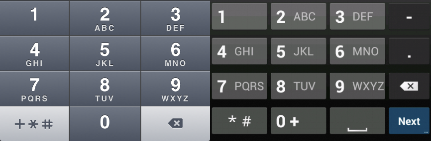
Click-to-call is still awesome and highly recommended. Here's how to make it a better experience:
- Be sure to preface the number with a strong call to action (Call us now, tap to call, etc.)
- Don't ever place a phone number in an image; it should always be live text in case the user wants to save the phone number for later use
- Include the international prefix ("+" followed by the country code) to ensure it works for global users
- Use a phone icon for a quick visual association
- If you have limited office hours, include them near the phone number
Apple's map application suffered some major bad press when it replaced the Google Maps application with the iOS 6 update and, for a while, users clicking on links that began with maps.google.com would be taken to a mobile-friendly Google site and not to a map application. This and device agnosticism, though, has taught us that we can't depend on the user always having the application we would hope would open for a better usability experience.
My Tip for 2013
There still is a disconnect between our experience on mobile OS browsers and installed applications. Generally, applications will interact with other applications (such as with installed Facebook or Twitter apps), but it's less frequent for a browsing experience to jump to an app. Nonetheless, we should consider that some interactions are just better suited for applications (like getting turn-by-turn directions, sharing a Facebook post, or watching a YouTube video). Here are some great calls to action that utilize installed apps:
- Watch the video
- Email us
- Get directions
- Add to my calendar
- Share (on Facebook, Twitter, etc.)
- Download (music, wallpaper, ringtone)
- Text to friend, text to enter a contest
- Upload photo / video
Fit Content to Size
Still important to not use absolute pixel dimensions so as to remain device agonistic. Media queries in CSS and device detection have made it a lot easier this past year to contextually load content or code to fit the viewport.
My Tip for 2013
I would add these key dimensions to keep in mind as you design your breakpoints:
- 320 x 480 (iPhone, iPod)
- 768 x 1024 (iPad)
- 720 x 1280 (Samsung Galaxy, some HTC devices)
- 540 x 960 (Motorola Droid devices)
- 800 x 1205 (Google Nexus)
Use Your Mobile META Tags
Still recommended:
<meta name="viewport" content="width=device-width, initial-scale=1, maximum-scale=1, user-scalable=no">
My Tip for 2013
You can add an Android property that allows developers to specify which screen resolution the page has been developed for.
<meta name="viewport" content="target-densitydpi=device-dpi" />
New Tips for 2013
Geotargeting
Geotargeting on mobile devices is much more precise than the IP targeting of desktops. Furthermore, I expect to see some new advances in near-field communication (NFC) that should make QR codes obsolete and offer a slew of new proximity-based calls to action. Be smart about your store locator by listing the closest store based on the user's location first.
Better forms
I already evangelized shorter forms on desktop landing pages, but let's face it: filling out forms on mobile devices sucks. Lots of pinching and zooming generally happen, autofill isn't working, you jump keyboards around looking for the right characters, or you inevitably make a spelling error and the entire form reloads…blank.
Ugh.
So avoid forms if you can or keep it down to just one field: email address.
And if you have to use a form, be sure that you are using the proper HTML5 field type. Mobile browsers use the <input type="" /> to display customized keyboard layouts that makes it easier to enter data.

URLs
<input type="url" />

Telephone Numbers
<input type="tel" />
Date & Time
<input type="date" />
<input type="time" />


Improve readability
Increase your font size to at least 16px. Don't force users to pinch and zoom to see or read your content.
Improve touch-ability
Yes, you should be using large, finger-friendly buttons. But consider the other gestures used on mobile devices: swipe, drag, pinch/spread, and rotate.
Your image sliders shouldn't be navigated with tiny little arrows or buttons; instead, a user should be able to swipe through a gallery or zoom in on a single photo without also zooming the text around it.
Consistency in a Cross-Device Flow
I truly think Google's idea of a multiscreen world will start to take off in 2013 with more ad spend in integrated digital campaigns. Responsive websites will be key, but mobile landing pages with adapted types of engagement for a mobile device will really determine the success of a campaign.
Allow users to save their progress between devices or save and send information to another device to complete the conversion.
Don't limit your conversion goals and calls to action to only one device.
About the Author
Adpearance is the digital marketing company obsessed with generating quality leads. Our solutions combine cutting-edge technology, premium tracking, and an expert team to transform business results.
Follow Us
Subscribe to our newsletter
Come on... You know you want to.
Subscribe to our newsletter
Get monthly newsletters with timely blogs and occasionally announcements for resources including in-depth reports, data-driven insights, and webinars.