18 Ecommerce Product Pages Done Right
The intersection of the moment a consumer decides to buy and the appeal and functionality of ecommerce product pages cannot be overlooked. Product pages do the heavy lifting in ecommerce, because it is at this stage where the decision to buy or not buy occurs. Product pages need to appeal equally to a buyer’s intellectual and emotional sides in order to win the sale.
Product pages have recently become even more important for brands. With the rise of product listing ads and dynamic retargeting, online merchants are sending potential customers directly to product pages more than ever before.
The goals of product pages are to:
- Effectively communicate a product’s characteristics through clean imagery, compelling copy, and the like;
- Kick off the buying process (i.e., include strong calls to action leading to a conversion);
- Cross-sell into other related products; and
- Allow for consumer-to-consumer sharing of product information.
Now, there is no one-size-fits-all for ecommerce product pages. Where a Question-and-Answer feature might make sense for one type of product, it might be overkill for another. The keys are addressing the pain points for your particular audience and then using that information to deploy assets that best translate the product’s characteristics.
Breaking the mold
In this blog post, we examine 18 examples of product pages done right. These 18 sites’ product page designs break the mold in at least one meaningful way, and as such, are worth examining. Warning—these killer ecommerce sites will cause you to open your wallet!
Simply Hike
Kudos to Simply Hike and their “order within” feature which creates urgency in the buyer’s mind. It’s all about contextualizing the product for the customer—the sooner you can get him/her to imagine himself/herself with the product, the closer you are to winning the sale.

ThreadSence
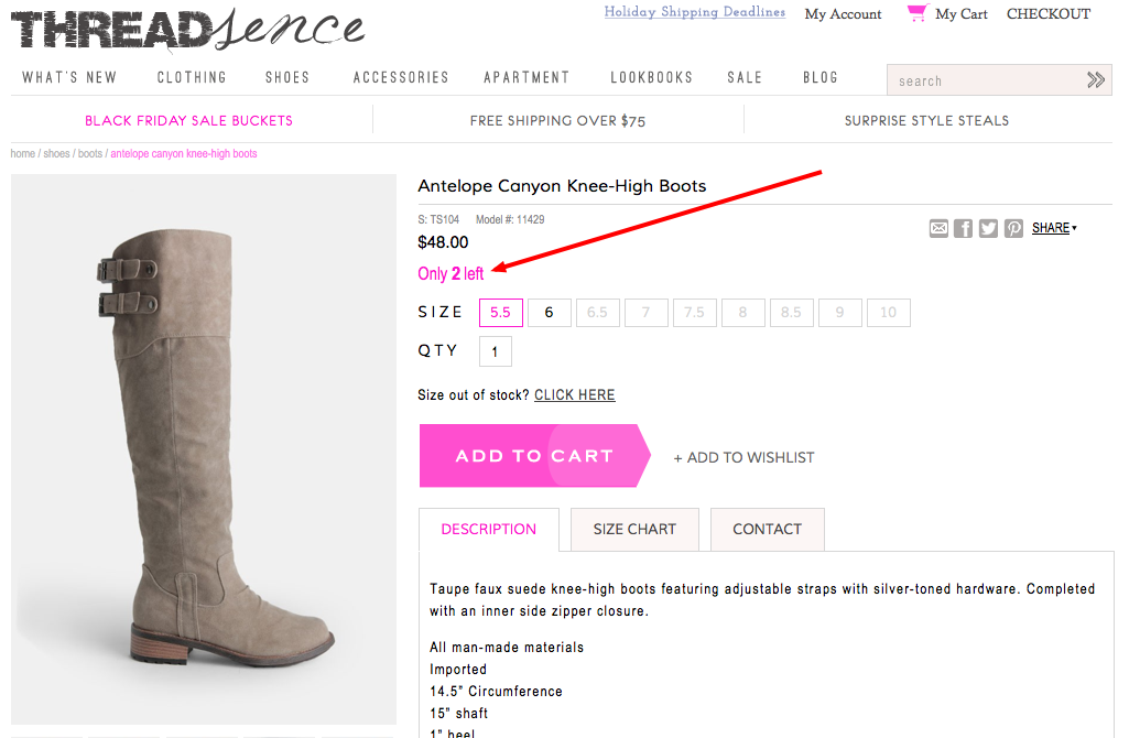
Similarly, ThreadSence also creates a sense of urgency showing stock levels (they also smartly provide the same info in their SERP).
Callaway Golf
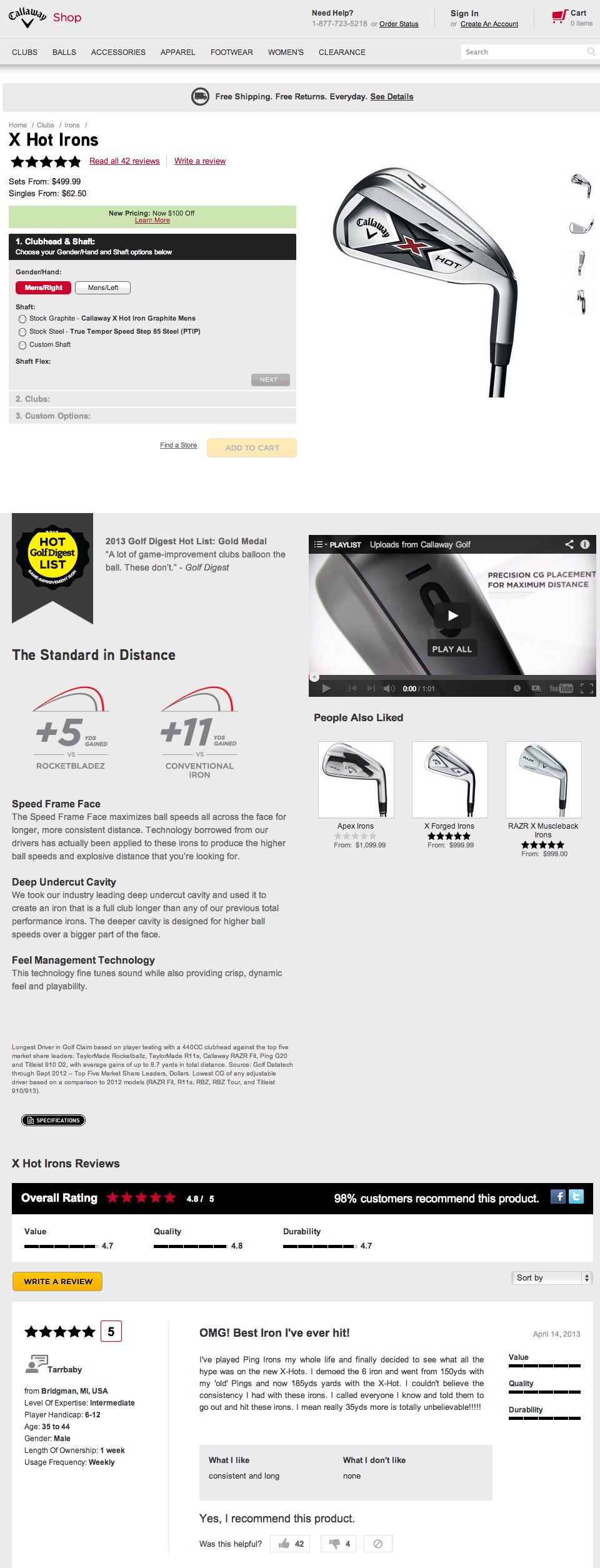
Callaway Golf bends the script with the buying module and photo areas flipped from the traditional layout. This almost feels like three separate product pages: the buying area is up at the top, followed by the specs/video/etc., and then lastly, reviews.
Callaway is jamming massive amounts of product assets on this page and pulling it off.
Carhartt
Especially during the holiday season, it’s crucial to set expectations when it comes to shipping timelines. Carhartt leaves nothing to fate when it comes to outlining these.

Adidas
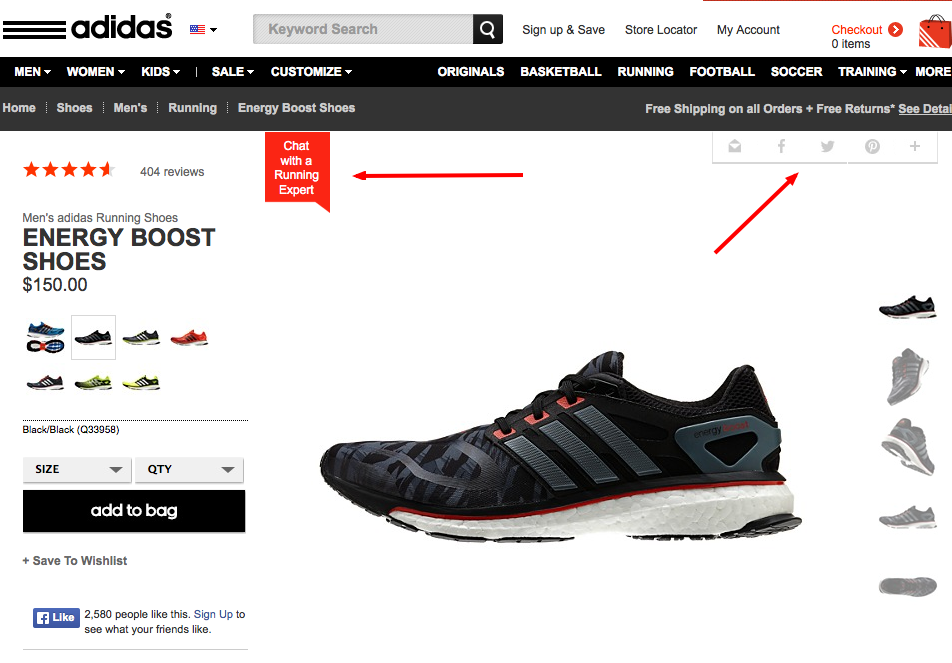
Adidas is doing several things right. First, we love that they integrate live help into the product page area. We also like how sharing has a muted presence—it’s there, but it’s not a distraction in its gray-scale treatment.
Lastly—and what you can’t see below this area—is a super-clean copy area with similar products, followed by a host of customer reviews in-line on the page. Well done.
Gnu
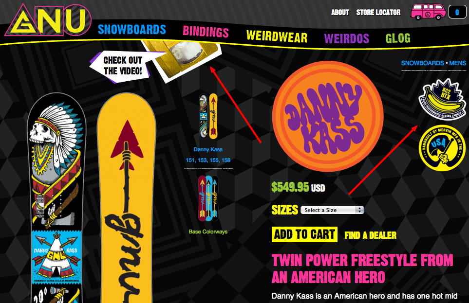
Gnu caught our eye not only because of its eye-popping, on-brand design, but also because the product pages incorporate two elements we like and don’t see often enough: motion (the checkout video graphic swings down into the frame after page load) and iconography (which can be super-helpful for customers in terms of orienting product characteristics at-a-glance).
Citizen Watch
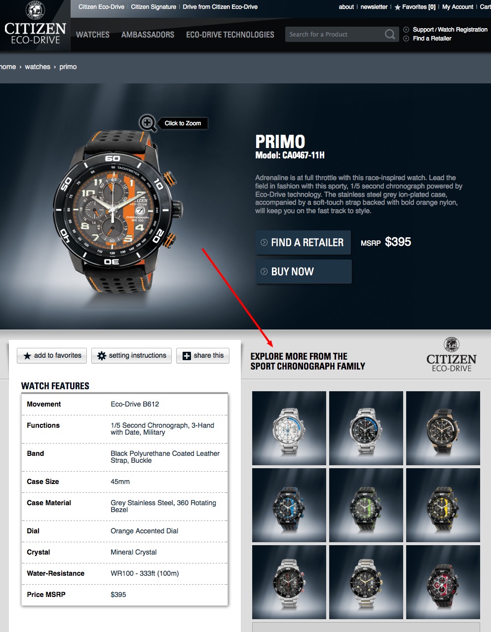
Citizen brings forth some nice merchandising within its product page. Check out the real estate they offer to browse nine similar products from the product page (a mini SERP!).
Backcountry.com
At Backcountry.com, the product pages are long, useful, and lovely, but what jumped out here was the reinforcement of the brand policies at a key area within the page.

DVF
Increasing product-page real estate to display similar items definitely seems to be a trend. We love how DVF does that above the fold.

East Dane
East Dane goes nice and tidy, keeping everything above the fold with this three-pane approach. This keeps the buying/sharing module clean to the left (a definite trend), with the copy box to far right.

Hugh & Crye
Hugh & Crye is also on trend with its inclusion of full-size alternate images on the product page. Why count on the customer to enlarge a tiny thumbnail when there is now is the bandwidth to show the details in full-size? We find this be a simple approach worth exploring for many types of products.

Nau
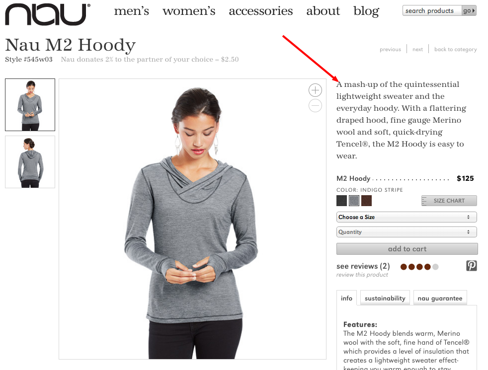
Sometimes it’s all about killer copy. Props to Nau for not only having compelling real-world product descriptions that read well, but also leading the column off with it.
Kaenon
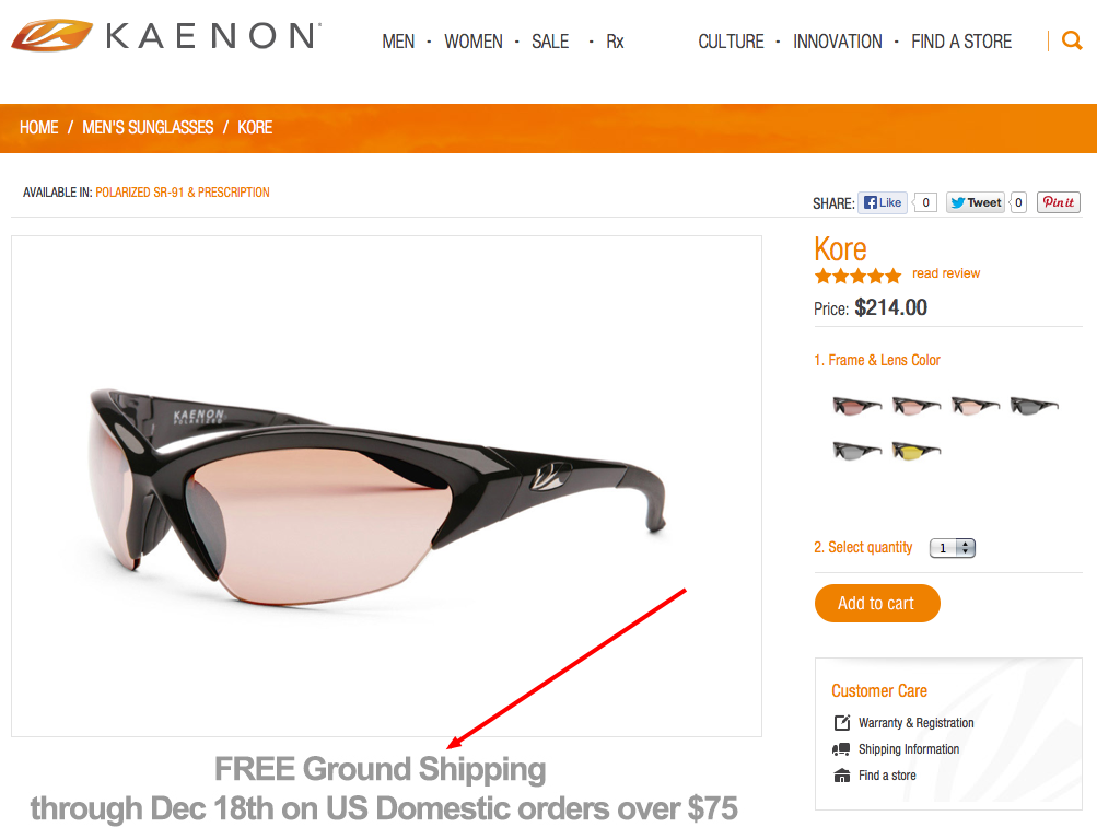
Kaenon allocates crucial product-page space (under the product image) to communicate a pertinent, promotional shipping message. Remember: as web users, we’re all tunnel-visioned in our approach, so if you want someone to see something, you need to put it right in front of them.
Eddie Bauer
For Eddie Bauer, it’s all about providing a clean product page but more importantly, highlighting the customer service angle.

Charlotte Russe
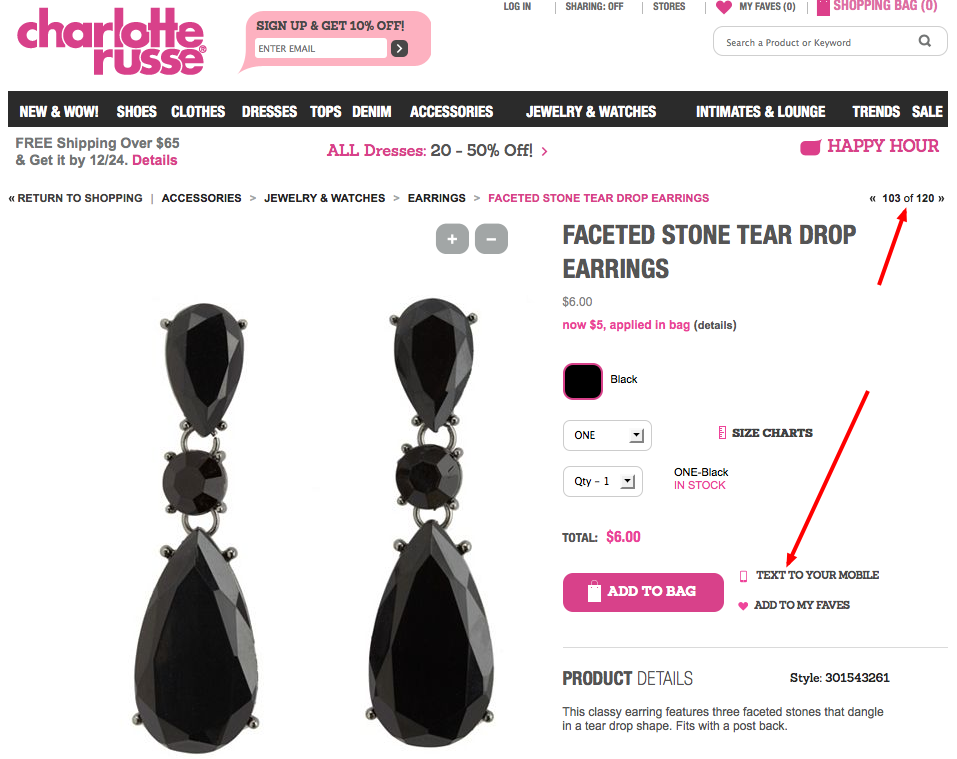
Charlotte Russe is rockin’ a send to your mobile share option. Very cool. Also, we love the ability to browse through products in a given category which is not new by any means, but often under-utilized.
Ecco
At Ecco, it’s the sharp photography that’s the star. Ecco nails it with their super-crisp, clean product images and lots of alternate shots (including video).

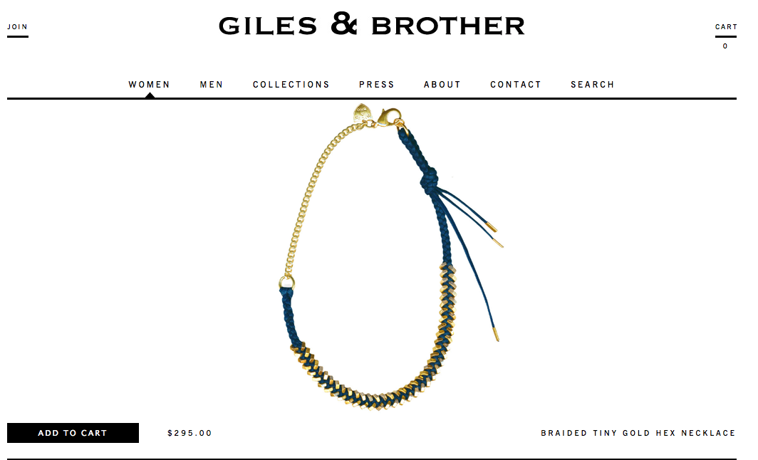
Giles & Brother
We had to include Giles & Brother as they blew us away in terms of their ultra-minimalist design. How about no other content above the fold other than the product name, price and Add to Cart button? Wow.
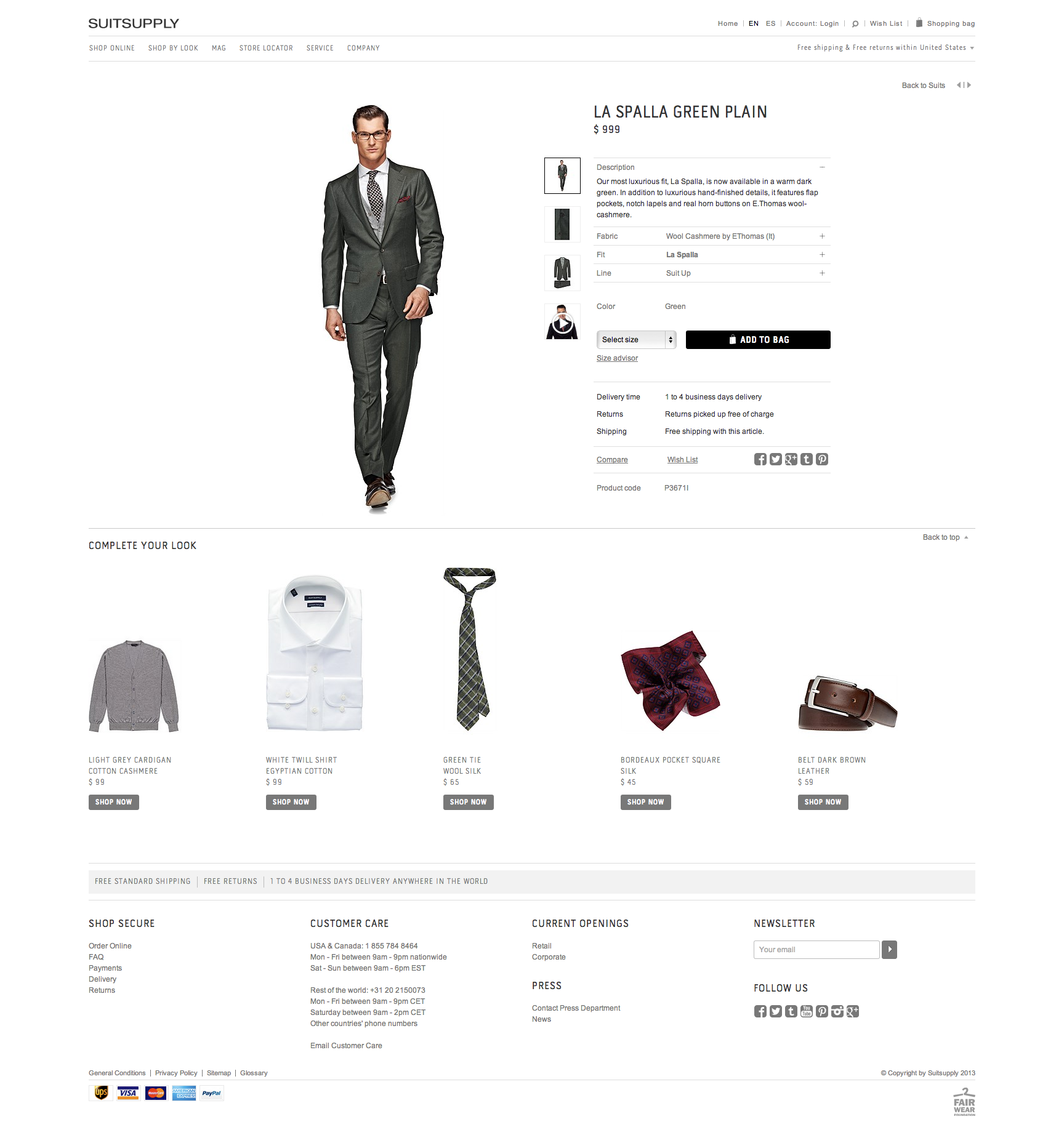
Suitsupply
Sometimes it just all comes together and you find yourself on a product page that sings for all the right reasons. For this last and certainly not least example, we point you to Suitsupply and their excellent use of white space, the full browser width, clean lines and a concerted emphasis which makes the threads the stars of the show.
Have you seen any killer product pages lately? Hit us up with some examples and why they rock in comments below.
About the Author
Adpearance is the digital marketing company obsessed with generating quality leads. Our solutions combine cutting-edge technology, premium tracking, and an expert team to transform business results.
Follow Us
Subscribe to our newsletter
Come on... You know you want to.
Related Posts
Subscribe to our newsletter
Get monthly newsletters with timely blogs and occasionally announcements for resources including in-depth reports, data-driven insights, and webinars.