20th Century Print Design Is Alive And Well On The Web
What’s old is new again when it comes to the future of web design. Adpearance designers find inspiration in 20th century print layouts for responsive websites.
As designers, we try our best to innovate constantly, but much of our work can find its structural and stylistic roots in print design from the 20th century.
From books to billboards, the influence of physical media can be sensed throughout the internet. This is truer than ever with the influx of Flat Design/Flat UI, responsive layouts.

Photography & typography
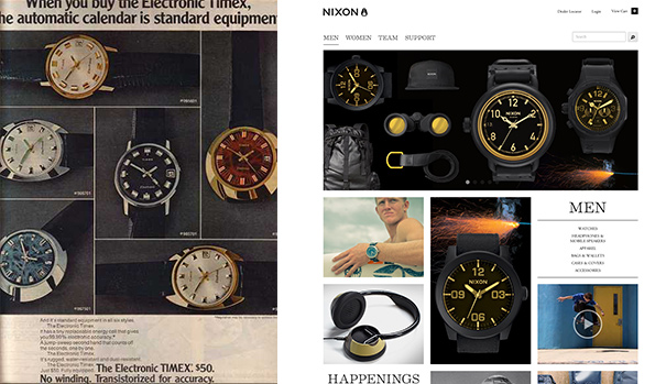
Although the presentation medium has changed drastically, layouts that feature large dramatic photography and strong typography are timeless. With bandwidth ever increasing, rich photography has taken center stage and pushed the small boxed-in and typographically bankrupt websites of the early to mid aughts into obsolescence. Solutions like Google Web Fonts and Typekit are also influencing this movement. Multi-column layouts, drop-caps, blockquotes and other hallmarks of print design are now commonplace.
Branding is on par with functionality
Magazine-type layouts are now commonplace amongst ecommerce sites especially those of fashion brands. Designers are no longer feeling the pressure to use flash(y) technologies simply because something is on the internet. They are focused on clean, easy to use interfaces that place branding on equal footing with functionality.
Responsive design is not new
Responsive web design is a technique for creating a single page that works seamlessly on any sized screen. We tend to think of it as a modern set of problems to solve but many of the design challenges associated with it have been tackled in the past with brochure and pamphlet design. Maintaining engagement on the “cover” while making all other content easily accessible and usable when the pamphlet is unfolded. It might be a bit of a stretch to call a brochure responsive, but I think some of the concepts carry over.
About the Author
Adpearance is the digital marketing company obsessed with generating quality leads. Our solutions combine cutting-edge technology, premium tracking, and an expert team to transform business results.
Follow Us
Subscribe to our newsletter
Come on... You know you want to.
Related Posts
Subscribe to our newsletter
Get monthly newsletters with timely blogs and occasionally announcements for resources including in-depth reports, data-driven insights, and webinars.